Pandas Plotting
In this lecture we will learn about pandas built-in capabilities for data visualization! It’s built-off of matplotlib, but it baked into pandas for easier usage!
Let’s take a look!
Imports
import numpy as np
import pandas as pd
%matplotlib inline
The Data
There are some fake data csv files you can read in as dataframes:
df1 = pd.read_csv('df1',index_col=0)
df2 = pd.read_csv('df2')
Style Sheets
Matplotlib has style sheets you can use to make your plots look a little nicer. These style sheets include plot_bmh,plot_fivethirtyeight,plot_ggplot and more. They basically create a set of style rules that your plots follow. I recommend using them, they make all your plots have the same look and feel more professional. You can even create your own if you want your company’s plots to all have the same look (it is a bit tedious to create on though).
Here is how to use them.
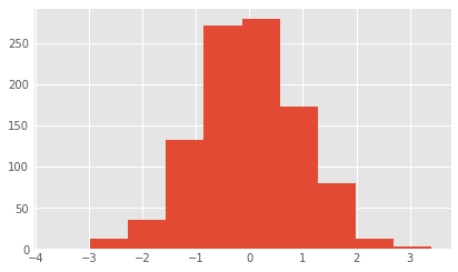
Before plt.style.use() your plots look like this:
df1['A'].hist()
<matplotlib.axes._subplots.AxesSubplot at 0x7fef50c19d68>
Call the style:
import matplotlib.pyplot as plt
plt.style.use('ggplot')
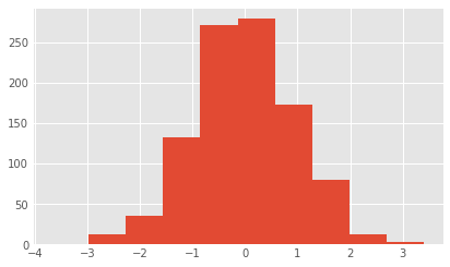
Now your plots look like this:
df1['A'].hist()
<matplotlib.axes._subplots.AxesSubplot at 0x7fef50a037b8>
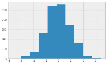
plt.style.use('bmh')
df1['A'].hist()
<matplotlib.axes._subplots.AxesSubplot at 0x7fef5096c550>
plt.style.use('dark_background')
df1['A'].hist()
<matplotlib.axes._subplots.AxesSubplot at 0x7fef508e80b8>
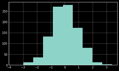
plt.style.use('fivethirtyeight')
df1['A'].hist()
<matplotlib.axes._subplots.AxesSubplot at 0x7fef508654a8>
plt.style.use('ggplot')
Let’s stick with the ggplot style and actually show you how to utilize pandas built-in plotting capabilities!
Plot Types
There are several plot types built-in to pandas, most of them statistical plots by nature:
- df.plot.area
- df.plot.barh
- df.plot.density
- df.plot.hist
- df.plot.line
- df.plot.scatter
- df.plot.bar
- df.plot.box
- df.plot.hexbin
- df.plot.kde
- df.plot.pie
You can also just call df.plot(kind=‘hist’) or replace that kind argument with any of the key terms shown in the list above (e.g. ‘box’,‘barh’, etc..)
Let’s start going through them!
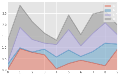
Area
df2.plot.area(alpha=0.4)
<matplotlib.axes._subplots.AxesSubplot at 0x7fef5081c080>
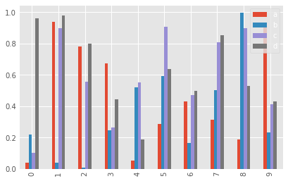
Barplots
df2.head()
| a | b | c | d | |
|---|---|---|---|---|
| 0 | 0.039762 | 0.218517 | 0.103423 | 0.957904 |
| 1 | 0.937288 | 0.041567 | 0.899125 | 0.977680 |
| 2 | 0.780504 | 0.008948 | 0.557808 | 0.797510 |
| 3 | 0.672717 | 0.247870 | 0.264071 | 0.444358 |
| 4 | 0.053829 | 0.520124 | 0.552264 | 0.190008 |
df2.plot.bar()
<matplotlib.axes._subplots.AxesSubplot at 0x7fef50762748>
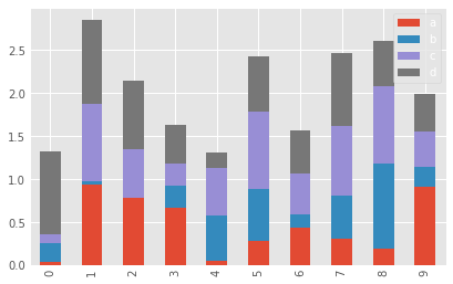
df2.plot.bar(stacked=True)
<matplotlib.axes._subplots.AxesSubplot at 0x7fef5070a780>
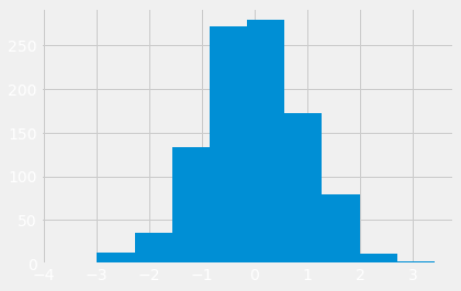
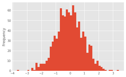
Histograms
df1['A'].plot.hist(bins=50)
<matplotlib.axes._subplots.AxesSubplot at 0x7fef50837ac8>
Line Plots
#df1.plot.line(x=df1.index,y='B',figsize=(12,3),lw=1)
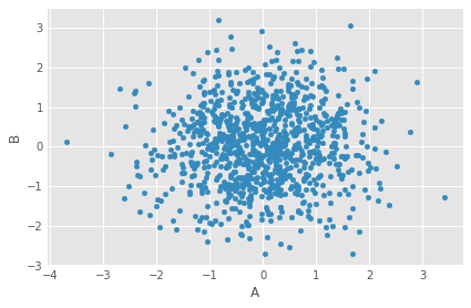
Scatter Plots
df1.plot.scatter(x='A',y='B')
<matplotlib.axes._subplots.AxesSubplot at 0x7fef505d8908>
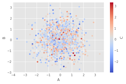
You can use c to color based off another column value Use cmap to indicate colormap to use. For all the colormaps, check out: http://matplotlib.org/users/colormaps.html
df1.plot.scatter(x='A',y='B',c='C',cmap='coolwarm')
<matplotlib.axes._subplots.AxesSubplot at 0x7fef50643278>
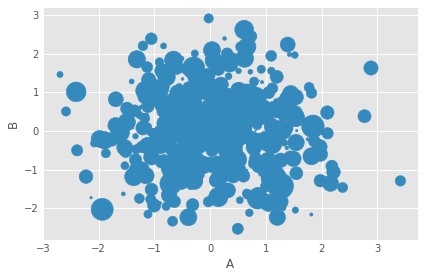
Or use s to indicate size based off another column. s parameter needs to be an array, not just the name of a column:
df1.plot.scatter(x='A',y='B',s=df1['C']*200)
/home/ggilmore/.local/lib/python3.6/site-packages/matplotlib/collections.py:857: RuntimeWarning: invalid value encountered in sqrt
  scale = np.sqrt(self._sizes) * dpi / 72.0 * self._factor


<matplotlib.axes._subplots.AxesSubplot at 0x7fef50465da0>
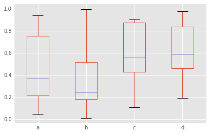
BoxPlots
df2.plot.box() # Can also pass a by= argument for groupby
<matplotlib.axes._subplots.AxesSubplot at 0x7fef50332e10>
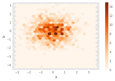
Hexagonal Bin Plot
Useful for Bivariate Data, alternative to scatterplot:
df = pd.DataFrame(np.random.randn(1000, 2), columns=['a', 'b'])
df.plot.hexbin(x='a',y='b',gridsize=25,cmap='Oranges')
<matplotlib.axes._subplots.AxesSubplot at 0x7fef502539e8>
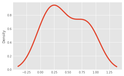
Kernel Density Estimation plot (KDE)
df2['a'].plot.kde()
<matplotlib.axes._subplots.AxesSubplot at 0x7fef50190780>
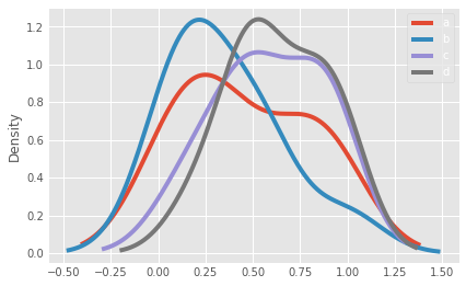
df2.plot.density()
<matplotlib.axes._subplots.AxesSubplot at 0x7fef47aaa908>
That’s it! Hopefully you can see why this method of plotting will be a lot easier to use than full-on matplotlib, it balances ease of use with control over the figure. A lot of the plot calls also accept additional arguments of their parent matplotlib plt. call.
Greydon Gilmore
Intraoperative Neurophysiologist Biomedical Engineer
My research interests include deep brain stimulation, machine learning and signal processing.