Categorical Data Plots
Now let’s discuss using seaborn to plot categorical data! There are a few main plot types for this:
- factorplot
- boxplot
- violinplot
- stripplot
- swarmplot
- barplot
- countplot
Let’s go through examples of each!
import seaborn as sns
%matplotlib inline
tips = sns.load_dataset('tips')
tips.head()
| total_bill | tip | sex | smoker | day | time | size | |
|---|---|---|---|---|---|---|---|
| 0 | 16.99 | 1.01 | Female | No | Sun | Dinner | 2 |
| 1 | 10.34 | 1.66 | Male | No | Sun | Dinner | 3 |
| 2 | 21.01 | 3.50 | Male | No | Sun | Dinner | 3 |
| 3 | 23.68 | 3.31 | Male | No | Sun | Dinner | 2 |
| 4 | 24.59 | 3.61 | Female | No | Sun | Dinner | 4 |
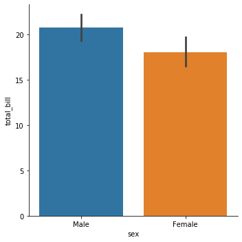
barplot and countplot
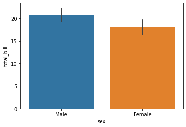
These very similar plots allow you to get aggregate data off a categorical feature in your data. barplot is a general plot that allows you to aggregate the categorical data based off some function, by default the mean:
sns.barplot(x='sex',y='total_bill',data=tips)
<matplotlib.axes._subplots.AxesSubplot at 0x7f527c50fa58>
import numpy as np
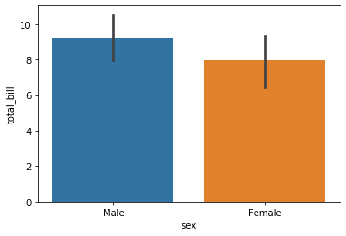
You can change the estimator object to your own function, that converts a vector to a scalar:
sns.barplot(x='sex',y='total_bill',data=tips,estimator=np.std)
<matplotlib.axes._subplots.AxesSubplot at 0x7f527c506dd8>
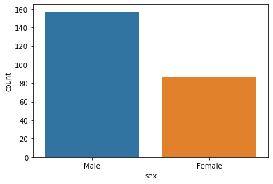
countplot
This is essentially the same as barplot except the estimator is explicitly counting the number of occurrences. Which is why we only pass the x value:
sns.countplot(x='sex',data=tips)
<matplotlib.axes._subplots.AxesSubplot at 0x7f527c460e48>
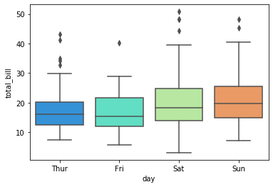
boxplot and violinplot
boxplots and violinplots are used to shown the distribution of categorical data. A box plot (or box-and-whisker plot) shows the distribution of quantitative data in a way that facilitates comparisons between variables or across levels of a categorical variable. The box shows the quartiles of the dataset while the whiskers extend to show the rest of the distribution, except for points that are determined to be “outliers” using a method that is a function of the inter-quartile range.
sns.boxplot(x="day", y="total_bill", data=tips,palette='rainbow')
<matplotlib.axes._subplots.AxesSubplot at 0x7f527c4e5710>
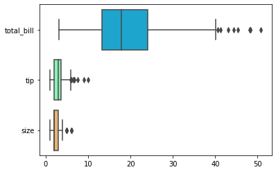
# Can do entire dataframe with orient='h'
sns.boxplot(data=tips,palette='rainbow',orient='h')
<matplotlib.axes._subplots.AxesSubplot at 0x7f527c352080>
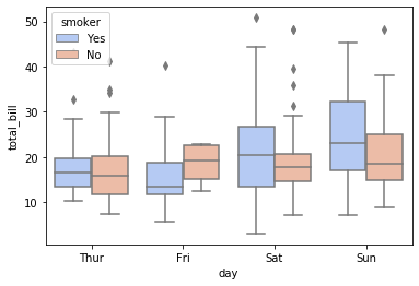
sns.boxplot(x="day", y="total_bill", hue="smoker",data=tips, palette="coolwarm")
<matplotlib.axes._subplots.AxesSubplot at 0x7f527c34b6d8>
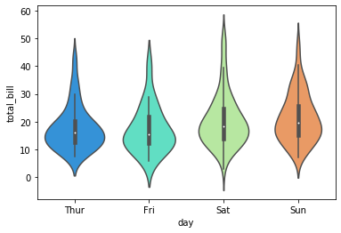
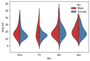
violinplot
A violin plot plays a similar role as a box and whisker plot. It shows the distribution of quantitative data across several levels of one (or more) categorical variables such that those distributions can be compared. Unlike a box plot, in which all of the plot components correspond to actual datapoints, the violin plot features a kernel density estimation of the underlying distribution.
sns.violinplot(x="day", y="total_bill", data=tips,palette='rainbow')
<matplotlib.axes._subplots.AxesSubplot at 0x7f527c1cc9b0>
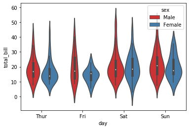
sns.violinplot(x="day", y="total_bill", data=tips,hue='sex',palette='Set1')
<matplotlib.axes._subplots.AxesSubplot at 0x7f527c14e470>
sns.violinplot(x="day", y="total_bill", data=tips,hue='sex',split=True,palette='Set1')
<matplotlib.axes._subplots.AxesSubplot at 0x7f527c0f6f98>
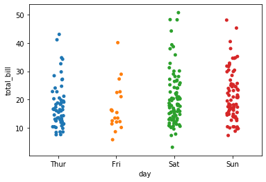
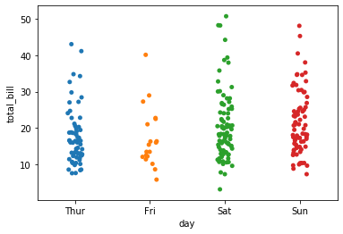
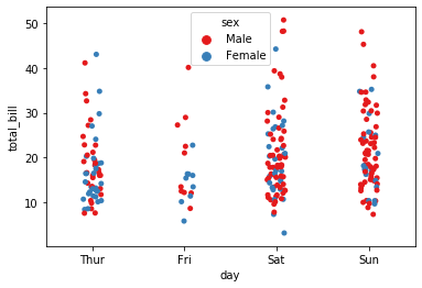
stripplot and swarmplot
The stripplot will draw a scatterplot where one variable is categorical. A strip plot can be drawn on its own, but it is also a good complement to a box or violin plot in cases where you want to show all observations along with some representation of the underlying distribution.
The swarmplot is similar to stripplot(), but the points are adjusted (only along the categorical axis) so that they don’t overlap. This gives a better representation of the distribution of values, although it does not scale as well to large numbers of observations (both in terms of the ability to show all the points and in terms of the computation needed to arrange them).
sns.stripplot(x="day", y="total_bill", data=tips)
<matplotlib.axes._subplots.AxesSubplot at 0x7f527c0206d8>
sns.stripplot(x="day", y="total_bill", data=tips,jitter=True)
<matplotlib.axes._subplots.AxesSubplot at 0x7f527bff4a20>
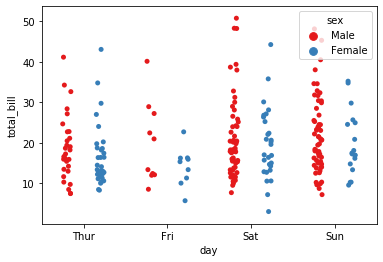
sns.stripplot(x="day", y="total_bill", data=tips,jitter=True,hue='sex',palette='Set1')
<matplotlib.axes._subplots.AxesSubplot at 0x7f527bf5d9e8>
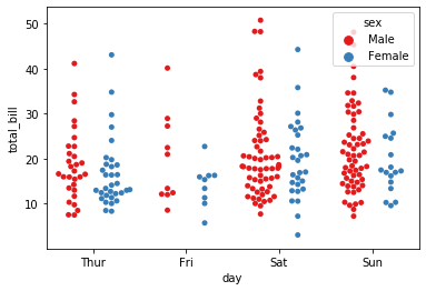
sns.stripplot(x="day", y="total_bill", data=tips,jitter=True,hue='sex',palette='Set1',dodge=True)
<matplotlib.axes._subplots.AxesSubplot at 0x7f527beceba8>
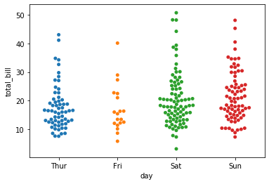
sns.swarmplot(x="day", y="total_bill", data=tips)
<matplotlib.axes._subplots.AxesSubplot at 0x7f527beb88d0>
sns.swarmplot(x="day", y="total_bill",hue='sex',data=tips, palette="Set1", dodge=True)
<matplotlib.axes._subplots.AxesSubplot at 0x7f527be82d68>
Combining Categorical Plots
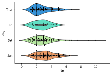
sns.violinplot(x="tip", y="day", data=tips,palette='rainbow')
sns.swarmplot(x="tip", y="day", data=tips,color='black',size=3)
<matplotlib.axes._subplots.AxesSubplot at 0x7f527be088d0>
factorplot
factorplot is the most general form of a categorical plot. It can take in a kind parameter to adjust the plot type:
sns.catplot(x='sex',y='total_bill',data=tips,kind='bar')
<seaborn.axisgrid.FacetGrid at 0x7f527bece4a8>
Greydon Gilmore
Intraoperative Neurophysiologist Biomedical Engineer
My research interests include deep brain stimulation, machine learning and signal processing.